|
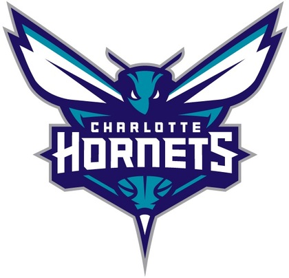
The NBA's Charlotte franchise officially returned to its roots on Tuesday, dispensing the moniker Bobcats, opting to a return to the more familiar name: Hornets. The primary logo utilizes the purple and teal color palette and features an aggressive-looking hornet that is ready to attack. Its piercing eyes, raised antennae, expanded wings and pointed stinger depict its relentless intensity. Incorporated within the logo is a basketball that doubles as the hornet’s body. The Charlotte Hornets wordmark is written across the insect. The logo contains several odes to that of the original Hornets with its white wings, white accents within its eyes, a stinger and the inclusion of a basketball. The logo represents several characteristics of actual hornets, including their swarming and attacking nature, along with their fierceness and relentlessness when protecting their nests. These same characteristics connect with the city of Charlotte itself. The city’s rebelliousness, aggressiveness and protective attributes date to the Revolutionary War when British commander General Cornwallis referred to Charlotte as “a hornet’s nest of rebellion.” “The logos are the foundation of an organization’s brand identity, and our goal was to design logos that would have awareness, be relevant and resonate with our fans,” said Bobcats Sports & Entertainment President & COO Fred Whitfield. “We developed a logo that physically depicted the characteristics and DNA of the type of team we want on the court, as well as those of hornets and the city of Charlotte.” As part of the unveiling, the organization also announced that the beloved “Hugo” will officially return to Buzz City as the team’s mascot. The Hornets brand identity includes a modernized version of the original “Hugo” logo that will be utilized for the mascot and its brand. This logo is designed and intended for use as it relates to Hugo, and supplies the organization with a separate identity for one of the NBA’s most famous mascots. The refreshed Hugo logo contains several similarities to the original, with Hugo wearing white gloves and basketball shoes, possessing that trademark smile and having the letter “H” on his chest. Rather than bouncing a basketball, the updated logo continues the theme of the basketball as part of the hornet’s body. “We recognize the heritage behind the original logo and our goal was to connect to the past but also include elements of an evolution,” Whitfield added. “With that in mind, we are thrilled to be able to bring Hugo back as our mascot. We realize all he meant to the city and our fans and we’re excited to re-introduce him this offseason.” The secondary logo features a side view of the hornet in an attacking position with elongated wings, aggressive eyes and extended stinger. The body once again consists of a basketball, while the curled body shape represents the letter “C” for the city of Charlotte. It also consists of the purple and teal colors like the primary logo. The Hornets wordmark includes the word Charlotte in teal written above the purple Hornets name. The entire brand identity – logos and wordmark – was designed in collaboration with senior executives within the Bobcats organization; Jordan Brand, a division of Nike; and the NBA’s Global Merchandising Group. Both Jordan Brand and Nike have a long history of working with professional teams and universities in developing brand identities and utilize some of the world’s most highly recognized designers.
|
Support WBOB Sports
|
Search For Your Favorite WBOB Author,
or BobCast
990WBOB
An Independent Media Outlet.
The views opinions and thoughts expressed do not reflect those of 990WBOB, its management or its staff. All Rights Reserved 990WBOB.com 2007-2020
Contact WBOB HERE
An Independent Media Outlet.
The views opinions and thoughts expressed do not reflect those of 990WBOB, its management or its staff. All Rights Reserved 990WBOB.com 2007-2020
Contact WBOB HERE

