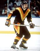
 Sometimes a team's identity is so memorable, that it becomes an international icon. The Yankee Pinstripes, the Cowboy Star, or the Bruins Spoked-B are all easily identifiable from a distance by even the most casual of sports fans. Other teams rely on gimmicks to gain the attention of fans. Sometimes this involves rebranding the team, choosing new colors, and the development of an alternate jersey. Some of these alternate jerseys are straight fire (see: Celtics St. Patrick's Day Unis), but often times, the results are just plain awful. Lets teak a look at some of the worst Alternate Jerseys ever worn! 5 Worst Alternate/Secondary Jerseys(5) 2009 Seattle Seahwaks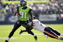 Navy Pants and Neon Lime Green Jersey? Ouch. The only redeeming quality would be if they glowed in the dark. They Do Not. (4) 2011 Maryland Terapins Football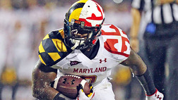 These Maryland Jereys were Baltimore-based Under Armour's attempt to make a splash into the football jersey market... Too bad they dove head first into the shallow end. (3) 2013 Notre Dame Irish (Big East Tourney)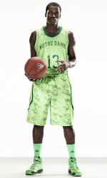 Adidas launched a new line of Jerseys designed for the 2013 NCAA Conference Tourneys. Several teams (UCLA, Louisville, Baylor, Cincy, and Kansas) were also benefactors. However, the Fighting Irish were the losers of this creation. The Pale Green uni's look like they were accidently washed in bleach. Plus look at those socks!? Come on Adidas! You're better than this! (2) 1998 MLB: 'Turn Ahead The Clock' Promotion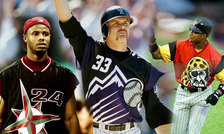 The late 1990's ushered in an era where teams were featuring "throwback" jerseys to pay homage to their franchise's past. However, baseball tried to be cute and make "Jerseys of the Future." The whole idea was ill-advised, especially the genius who thought it would be cute to temporarily rename a team the "Mercury Mets." The concept never caught on (thank god), but we still have the searing memory of on-field fashion gone terribly wrong. (1) Washington Wizards (2008)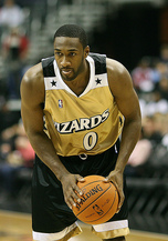 Checklist for an awful Basketball Jersey: 1. Unmatched Shorts and Shirt [X] 2. Completely Different Color Scheme from Logo, Court, and Regular Uniforms [X] 3. Being Named the Washington Wizards [X] The only thing worst... the team's regular jerseys. -Kevin Aherne |
Support WBOB Sports
|

Search For Your Favorite WBOB Author,
or BobCast
990WBOB
An Independent Media Outlet.
The views opinions and thoughts expressed do not reflect those of 990WBOB, its management or its staff. All Rights Reserved 990WBOB.com 2007-2020
Contact WBOB HERE
An Independent Media Outlet.
The views opinions and thoughts expressed do not reflect those of 990WBOB, its management or its staff. All Rights Reserved 990WBOB.com 2007-2020
Contact WBOB HERE